TL;DR
TTB’s custom CMS dashboard was locked into a rigid, single-brand system with hardcoded styles. I designed and implemented a scalable theming strategy using ShadCN, enabling white-labeling, dark mode, and future multi-brand support — while delivering a clear migration plan and full design system transition.
🧠 Summary
Thru the Bible (TTB) needed their custom CMS dashboard — which handled global content for audio, video, and literature — to evolve beyond a one-brand, hardcoded system. My job was to develop a modern theming strategy and hand off scalable, developer-ready design assets using a flexible component architecture.
🚨 Problem
The current CMS (called ECMS) was fully custom-coded and hardwired to a single brand identity. Every color, radius, and layout value was baked directly into the code. That made it:
Painful to maintain
Impossible to theme for different brands
Not future-ready for dark mode or accessibility updates
The business wanted the ability to white-label the dashboard across international partners and brand contexts.
👥 Team
I was the lead designer overseeing design systems, implementation planning, and dev alignment
Worked with TTB’s internal dev team who owned the React codebase
Stack: Custom React + ShadCN + TailwindCSS
🎯 Role
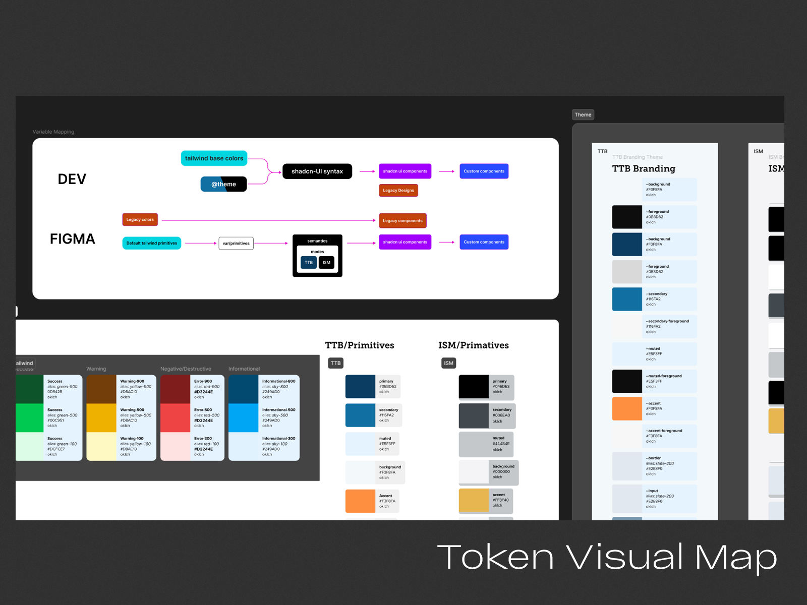
Audit of legacy system and variables
Theming roadmap + migration plan
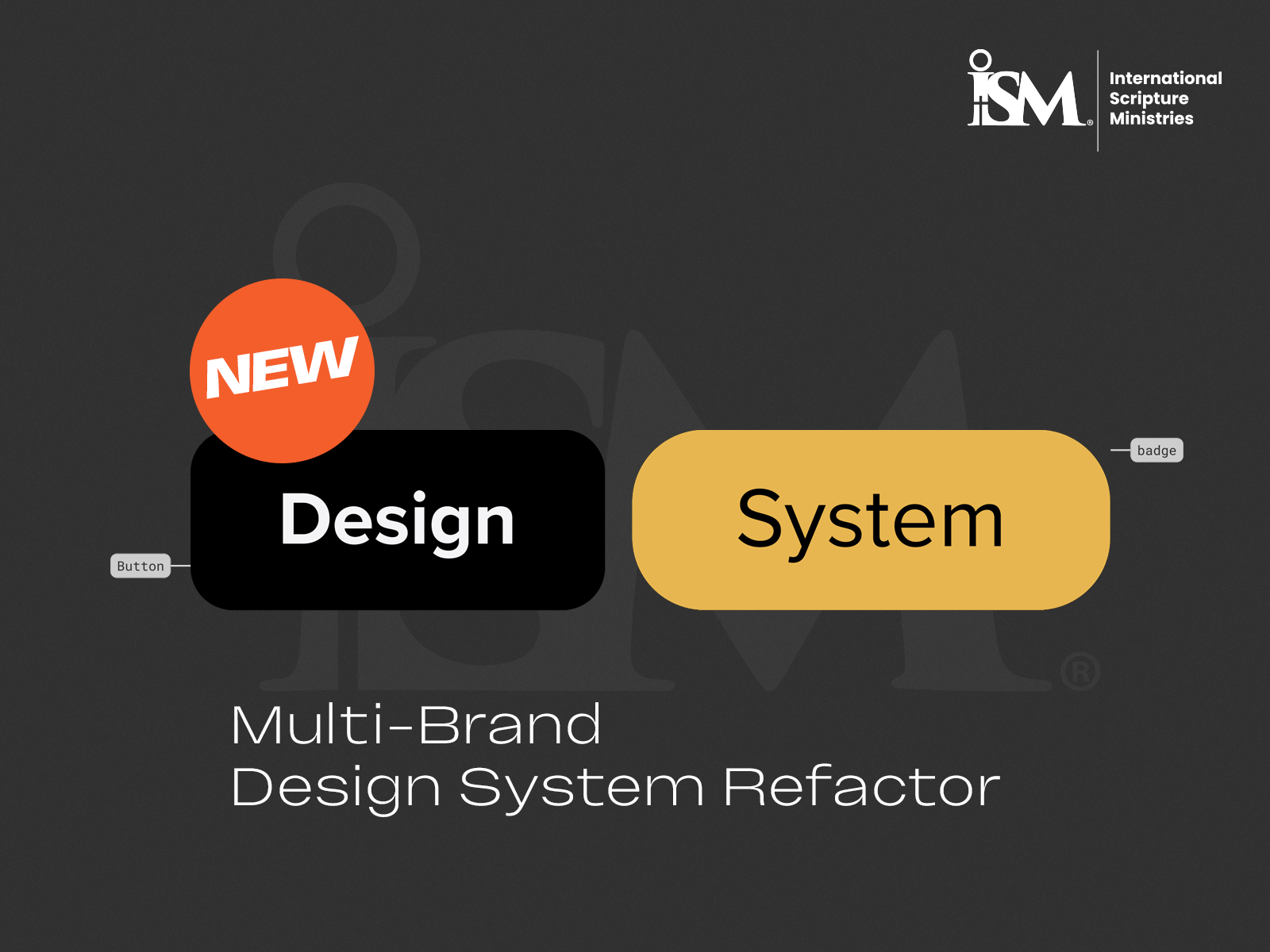
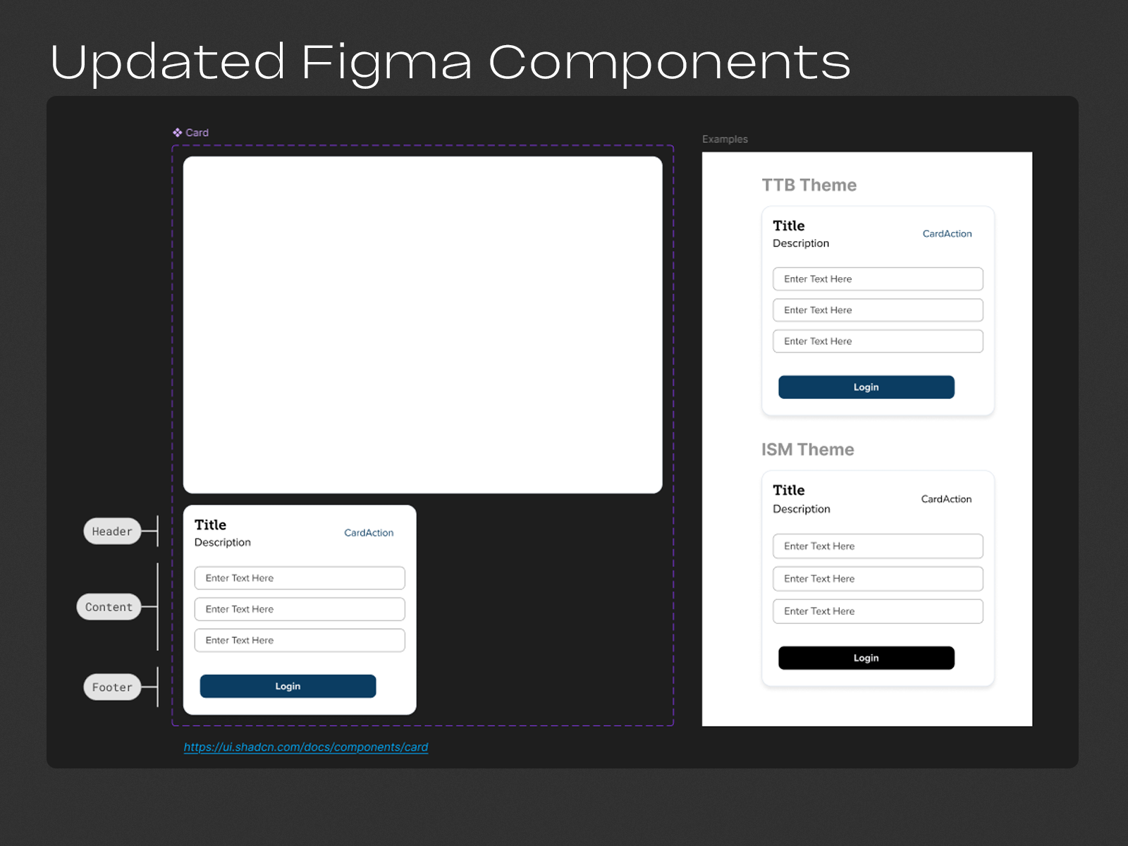
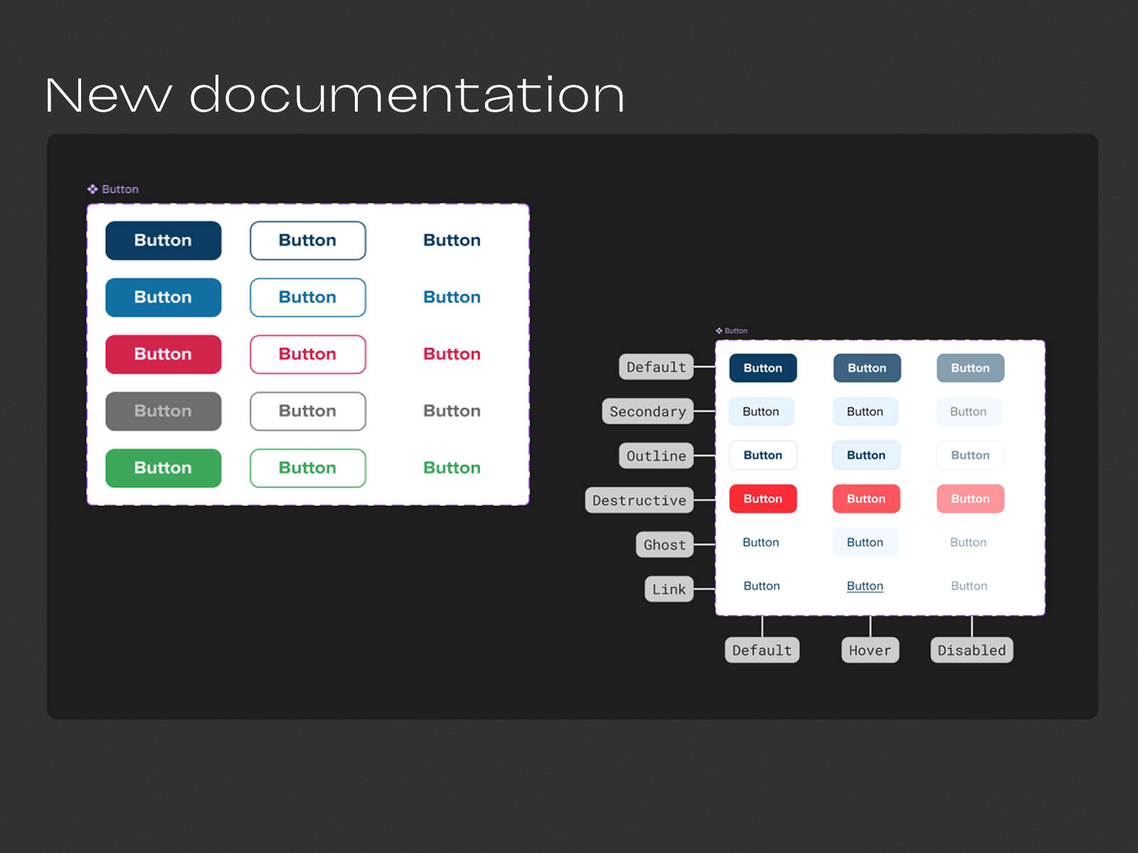
Design system rebuild using ShadCN
Created a transition guide mapping old tokens → new variables
Designed net-new components where ShadCN didn’t meet needs
Built dual system fallback: “legacy” + “modern” side-by-side
⚙️ Constraints
CMS was already live with real users
Changes had to avoid disrupting production styling
Some components were from an external library and had to be matched visually
Had to support both static branding and future dynamic theming
🔍 Process
System Audit
Reviewed every hardcoded value in the current CMS — typography, spacing, borders, shadows, etc. Logged inconsistencies and created a variable map.
Theme Migration Plan
I built a doc that clearly mapped current values to ShadCN tokens and Tailwind variables. This served as a shared source of truth for devs.
Dual-System Setup
Created a “legacy” design system (what we had) and a “modern” one (using ShadCN). This made it easy to test changes incrementally without breaking the UI.
Custom Component Design
Used ShadCN as the base library. For components it didn’t cover — or didn’t match TTB’s brand — I designed custom versions that still fit within the theme token structure.
White-Label Strategy
Outlined how to add future brand themes by updating a single CSS variable file — instead of hardcoding brand logic into components.
📈 Results
A full multi-brand theming architecture
Devs unblocked from hardcoded visual decisions
System now supports future white-label partners
Ready for dark mode and accessibility upgrades
Delivered a living design system for new features going forward
🧠 Learnings
The hardest part wasn’t the visual redesign — it was reverse-engineering and mapping the old system cleanly. This process taught me the value of creating transitionable systems: ones that don’t just look good but make future change cheaper. I now set up every new design system with theming baked in from day one — even if a client doesn’t ask for it up front.